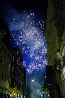
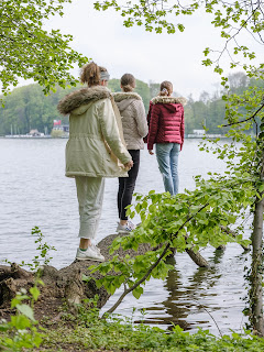
I love color street photography!
This article is a great follow up to the previous one (http://robvisualfuji.blogspot.de/2016/01/street-photography-should-be-like-this.html).
As I started to focus more on street photography I thought that I have to take more images in black and white, because most of the photos on the web are colorless when it comes to this genre. And I processed my photos in black and white because I wanted to do it like a real pro. But there are a lot of photos where this reduction to gray scale ruins the hole thing. The matching colors, the shine or glow and sometimes even the hint of color in a dull environment is lost in 250 shades of gray. (hehe)
I had a great laugh as I watched a video on youtube were a street photographer said that this street scene is great because the colors match perfectly. After he took the photo of this scene he said that there is only a b&w film in his camera. So sad...
In a late twitter poll black and white was ahead color with seventy percent of the votes. Maybe many photographers may think that b&w will create this Henry Catier Bresson look of the early days of street photography and real SF should look like this. I don´t think that there are important rules to follow.
Don´t get me wrong, there are many scenes that work great in black and white.
In the photo above there was too much color. The wall behind was blue, the wears neon yellow sneakers (the soles). The original photo is overloaded with color and the main message (the gun) is lost in color (for my taste). So black and white works great on this photo.
But I also think that there are a lot more great color photos because the world is colorful and you loose so many details by snapping only in b&w.
There are photographers out there who pray to be consistent in your photography and don´t mix color and b&w. And I say: kick the last sentence down the stairs and do your own thing!
I love strong colors and mostly shoot in simple Velvia colors of my Fuji digital. I don´t use VSCO or other tools to achieve a certain (retro or whatever) look. I want to keep it simple, but strong!
The photo above would be boring without the colors in it. The diagonals and the girl in the center are quite interesting. But without the strong color texture in the background the fotos will loos so much of its power!
As I said in the last article. Don´t listen to the web, other photographers etc. Try to listen to your inner voice. Play with the medium and find out what makes you happy. You love strong colors? Boost them!
And the good thing about digital photography (for me) is, that you can decide later if you want to go b&w or color when processing the final image.
Do you love color street photography? How do you process your photos (or what kind of film do you use)? Let me know in the comments!
Cheers,
Nils
As I started to focus more on street photography I thought that I have to take more images in black and white, because most of the photos on the web are colorless when it comes to this genre. And I processed my photos in black and white because I wanted to do it like a real pro. But there are a lot of photos where this reduction to gray scale ruins the hole thing. The matching colors, the shine or glow and sometimes even the hint of color in a dull environment is lost in 250 shades of gray. (hehe)
 |
| stars? |
In a late twitter poll black and white was ahead color with seventy percent of the votes. Maybe many photographers may think that b&w will create this Henry Catier Bresson look of the early days of street photography and real SF should look like this. I don´t think that there are important rules to follow.
Don´t get me wrong, there are many scenes that work great in black and white.
 |
| the boy was wearing yellow sneakers that were very distracting in front of a blue background |
But I also think that there are a lot more great color photos because the world is colorful and you loose so many details by snapping only in b&w.
 |
| Shine on background! |
I love strong colors and mostly shoot in simple Velvia colors of my Fuji digital. I don´t use VSCO or other tools to achieve a certain (retro or whatever) look. I want to keep it simple, but strong!
The photo above would be boring without the colors in it. The diagonals and the girl in the center are quite interesting. But without the strong color texture in the background the fotos will loos so much of its power!
As I said in the last article. Don´t listen to the web, other photographers etc. Try to listen to your inner voice. Play with the medium and find out what makes you happy. You love strong colors? Boost them!
And the good thing about digital photography (for me) is, that you can decide later if you want to go b&w or color when processing the final image.
Do you love color street photography? How do you process your photos (or what kind of film do you use)? Let me know in the comments!
Cheers,
Nils


Comments
Post a Comment